7
$\begingroup$

I'm not too versed in computer graphics so my question may be vague.

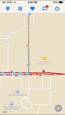
I'm given a sequence of GPS coordinates which I draw on an iOS map, and they define bus routes. Some of the bus routes happen to share sections of certain streets however, and when multiple routes are being drawn on the map the colored line segments are just being overlapped currently.

I'm currently looking into computationally separating the lines from each other before drawing, but I'm not sure that will get any success. So my backup is: are there any good techniques to draw the lines in a way that somehow does not hide the lower line segments, and retains at least partially their color?

Again as a disclosure, I'm not very knowledgable in this area. I know from Photoshop there are different color modes on the layers that have different effects when overlapped. Would something of that sort help in this situation? Or maybe there's a way to dash the lines such that it alternates each color, but I imagine that would be fairly difficult.

I'm just probing around for different techniques for this problem.
$\endgroup$

2 Answers 2

4
$\begingroup$

This question should most probably be asked on GD.SE or UX.SE. These sites specialize in how to design the graphics and how to choose the graphics for your purpose. But since you are here basic options are:

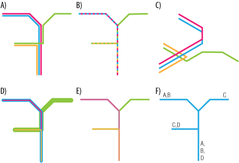
  1. Routes dont overlap but are parallel like electronic layouts (image 1, A), Works well unless you have many overlapping things.
  2. Space interleaved lines, differently colored line regions (image 1, B). Such as dashed lines, however many other interleaved shapes are possible.
  3. Spatial solutions, lines on top of each other but laid over in 3d (image 1, C), Works well in isometric drawing.
  4. Different line widths (image 1, D)
  5. User suggested, overlay (image 1, E).
  6. Same color but labels on segments (image 1, F), note not all segments need to be labeled as humans can interpolate values somewhat. This has benefit of being able to be paired with any other effect and works well with selection highlights with info intact.

enter image description here

Image 1: Different overlay methods.

Note: None, except the labeling works well when there are very many different lines as humans capability to see different colors in this kind of context as differing data is not very good (ask UX.SE).

As for what is best depends. None of these are particularity hard to do in code or vector drawing application (but that is out of scope ask GD.SE). Whichever is best for the user or the design is also not within the scope of this software (ask GD.SE or UX.SE).

$\endgroup$
2
$\begingroup$

You could:

  • Draw them all with different widths and make each transparent (fiddling with alpha blend to make it look nice). Or make the depth proportional to the width, so the widest is always drawn at the bottom of the pyramid. The naive implementation would suffer with many routes.

  • Not do anything special at intersections, and expect the user to infer what is going on from context.

  • "PWM" the colors of the lines, one way to do this might be to make a chessboard-like grid texture of 0's and 1's, and depending on whether there is a zero or a one where the road falls, choose the color to draw.

  • You could use the above technique for multiple line colors by further subdividing the grid with multiple colors. This would be tedious to do in a shader, but is trivial using a normal CPU image manipulation library.

Here is a bus routing app (Transloc Rider) that does this pretty well.

transloc rider

$\endgroup$

Your Answer

By clicking “Post Your Answer”, you agree to our terms of service and acknowledge you have read our privacy policy.

Not the answer you're looking for? Browse other questions tagged or ask your own question.