22
$\begingroup$

I am currently trying to understand a few things about vector graphics rasterization and the different ways it is implemented in various application types.

I tested and compared a few programs and noticed that there is a major difference in the way anti-aliasing behaves in the rasterization process. I am especially interested in the rendering behavior in Illustrator. You will see why by reading further.

Base image

For my testing, I used a really simple composition of triangles organized in an irregular hexagon with different colors.

Vector graphics softwares

Here are three renders of the same vector graphic in Illustrator, Affinity and Inkscape. (The image produced in Affinity and Inkscape are exactly the same.)

Images rendered in popular graphic editing tools

As you can see there is an undesired white line on each of the edges in the image rendered with Affinity and Inkscape. The anti-aliasing does not fill this area with a solid color which results in a small gap between adjacent shapes.

Although there is no gap in the Illustrator render, the edges of the shapes look as smooth as the Affinity render.

Here is an image showing the same area of each image upscaled.
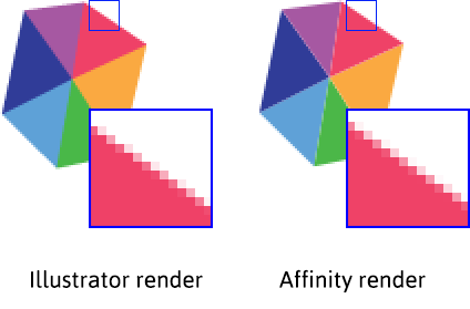
Upscale render showing anti-aliasing

There is a very subtle difference between the two images. The Affinity render is a tiny bit smoother but it is almost impossible to see the difference when looking at the images in their original sizes.

Browsers

SVG rendering

Displaying the same graphics exported as SVG in a browser looks very similar to the raster image produced by both Affinity and Inkscape.
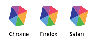
SVG file rendered in browser

There are very tiny differences in edges anti-aliasing (that are not really worth showing here) but SVG rasterization in common browsers behaves pretty much the same.

Decomposed render

Testing Illustrator rendering a bit further, I tried splitting parts of my graphics and exporting them individually then composing them back together with a raster editing software.
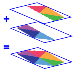
Image recomposition scheme

In theory it would result in the same image as having it in a single piece, but the result is slightly different using this method.
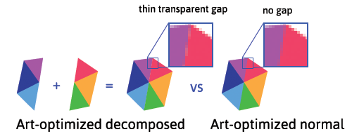
Result of recomposed image

As shown, when the two parts are composed, there is a tiny gap between them. Though it is more subtle, it is very similar to the graphic rendered in Affinity.

Polygon rendering

Blender (3D software)
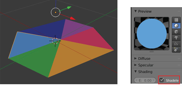
SVG in Blender viewport

Blender allows you to import SVG files and manipulate them as curve objects. Here is the imported graphic shown in the 3D viewport. (By default material will be affected by lights in the scene. Checking the shadeless property in the material property panel will allow the shapes to be rendered with their original colors.)

Here is a render made of the SVG inside Blender.
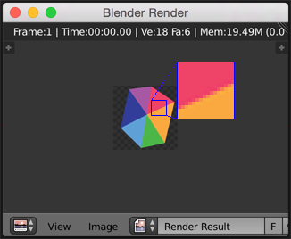
Actual render in Blender

It does not have any gap between the triangles. Other 3D softwares are very likely to work the same way. So Blender behaves just like Illustrator, or does it? Maybe it is the other way around?

The real questions

  • Which vector drawing library does Illustrator use behind the scenes?
  • Could it be possible that Illustrator makes use of a sort of 3D rendering engine? Is it open source? (probably not?)
  • Can any of the well known vector drawing libraries such as Cairo and Skia achieve the same rendering behavior? (No gap between shapes)
  • Is there any less known vector drawing library out there that has the same behavior?
$\endgroup$
1

2 Answers 2

13
$\begingroup$

As as far as I can tell Illustrator has 2 or 3 different rasterizer. The onscreen preview is also prone to the same gap artifacting as your show though its tuned to minimize the effect. Your post seems to imply that your interested in the "art optimized" output.

Art optimized versus screen preview of illustrator

Image 1: The different render modes of illustrator. Art optimized on left and hinted on right. Note that hinted shows slight background through. I dont have the new CC version so i can not show the third.

How does art optimized work then

Art optimized render mode is simply a un-antialiased image rendered at higher resolution, that has then been subjected to a box filtering. This is called super sampling which is costly. A box filter is simply the mean value of the samples in the box (pixel). This is indeed a similar technology as what the multi pixel filter used in your blender render uses. You can do the same thing manually and get same results.

In fact the render you get form illustrator is not really good. Its rendered in nonlinear space and not corrected for and you can get better results by swapping to higher order filters and computing in linear color space. All multi sample methods exhibit the same correct rendering (given enough samples even mathematically correct).

enter image description here

Image 2: Multi pixel filtering, on left illustrator native 'Art Optimized'. On right same image at 16x16 pixels with multi lobed Lanczos filter in linear space. Make sure your zoom is 1:1.

The problem

You have in fact come at terms with the real problem of current generation of onscreen renderers. They try to avoid multi sampling in favor for coverage calculation. But it simply can not work perfectly! Simply because alpha blend is:

$$c_0= c_1*\alpha + c_2*(1-\alpha)$$

When chained never reaches 0 when chained over semitransparent surfaces so background show trough. Also it does not know how the coverage is distributed so it will do it wrong. There's simply no way around this in a non-overlapping case like this. but if you allow the shapes overlap then the coverage calculation can be solved (See here).

Other questions You can get same result in any other engine by just simply multisampling a non-antialiased image. You can not get the effect in on screen renderings without doing the overlap trick because they optimize for speed. Does illustrator use 3D? New CC might depends on your interpretation of what 3D is. This issue has nothing to do with 3D just about signal reconstruction methods so its not applicable to the question really.

$\endgroup$
3
  • 1
    $\begingroup$ BTW, for a more detailed look at why alpha blending doesn't "do the right thing" in cases like this, check out this paper: Interpreting Alpha by Andrew Glassner. $\endgroup$ Commented Dec 24, 2015 at 21:34
  • $\begingroup$ @NathanReed Will look thnx, but here it is simply that even if alpha worked right coverage wont know which parts cover the pixels and which not. So Two layers with 50% alpha could mean fully opaque or only one layer visible because objects fill identical region we just dont know. $\endgroup$
    – joojaa
    Commented Dec 24, 2015 at 22:06
  • 2
    $\begingroup$ @joojaa Yes that's basically the point the paper is making: alpha can represent either opacity, coverage, or a combination of both. :) $\endgroup$ Commented Dec 25, 2015 at 0:15
5
$\begingroup$

And just to add: it is called "conflation" artifact and this is what AntiGrain Geometry used the compound shapes rasterizer for, see:

flash_rasterizer.png
(source: sourceforge.net)

Also, this is what NV Path Rendering claims to improve on:

An Introduction to NV_path_rendering (p. 67) or NV_path_rendering FAQ (#29).

$\endgroup$
0

Your Answer

By clicking “Post Your Answer”, you agree to our terms of service and acknowledge you have read our privacy policy.

Not the answer you're looking for? Browse other questions tagged or ask your own question.