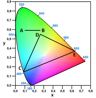
The first thing to say is that the line and triangle in the chromaticity diagram show the result of mixing coloured lights,
so the triangle works for the additive RGB model which is mixing emitted light on a video screen,
but mixing pigments will not result in a colour range in a straight line or triangle from the location of the pigment in the chromaticity diagram.
In the HSL chart neither additive light mixing nor subtractive pigment mixing will generally result in a colour directly between the two colours.
Typically the HSL chart will be defined in an attempt to make the full gamut of colours a circle, and then smaller gamuts are illustrated within this circle.
All the attempts to do this I have seen appear to be hand-drawn estimates of the resulting gamuts, such as these:


Please note that in this diagram the "visible colour gamut" is illustrated with the RGB gamut of the computer display, despite being labelled as a wider gamut.
It is also not trivial to define what is meant by "visible colour gamut" in HSL terms, which may contribute to these charts typically showing different ranges for CMYK etc. It is only the chromaticity chart which has a simple, clear limit for the "visible colour gamut".
You could define an HSL chart with the sRGB gamut as a circle, and then calculate all the possible mixtures of a set of colours using additive or subtractive mixing.
I think you would get gamuts with curved lines in HSL space joining the original colours, but notable corners at the original colours and their secondaries.
HSL space is not well suited to do exact displays of such colour ranges. You might be better looking at other spaces. CIELAB space will have some similar issues, but it is at least exactly defined, and the ab plane within CIELAB might give you what you are looking for.
If you want a gamut with straight lines for mixing colours, you could look at DKL space, which is not as commonly used, but for colour mixtures produces gamuts which are polygons with straight edges in my experience.


