Few things, but usually this is what it takes to make the difference:
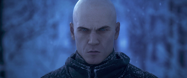
1- the material reflection at his head, he is bald, yet the diffuse texture shows color difference where the hair is, this means he has a shaved head, not a natural bald, this should translate in reflection, take a look at his head, top right (top left for the image), the reflection is very smooth, no bumps at all, there should be some indication in reflection to the tiny hairs that you can see in the texture map.
2- the wrinkles in his face need to be emphasized, he looks like some kind of a worrier, yet he has very smooth skin like a 15 year old has, I'm not talking about deep scars, I am talking about skin texture and bumpiness due to rough way of life, skin bumps, moles, a minor infection that will affect both coloration and bumpiness.
3- his mouth is off, the size and positioning, I know that many people has small mouths, and a relatively large distance between the nose and the mouth, but that drives the attention of the viewers, it feels wrong, even if it was a photo of a real person, you can spare this kind of dragging attention to extreme shapes if reality is what you're after.
4- This is a minor thing, but it had a role to play, the background and outfit, they look fake, this drives the viewers automatically and subconsciously to feel that this is not real, try to put more effort in these, making the outfit less uniform, and the background to have more realistic pattern, with more hue variation.
5- And last, the eyes, there's no reflection, yet the lighting is low and the image is small, so I am not sure if this is due to lighting or to the material itself.
That all been said, all these remarks are minor, the artwork looks awesome, I don't think a CG artwork should look like a photo, a perfectly realistic CG artwork that looks exactly like a photo, will become just another photo to the viewer.
